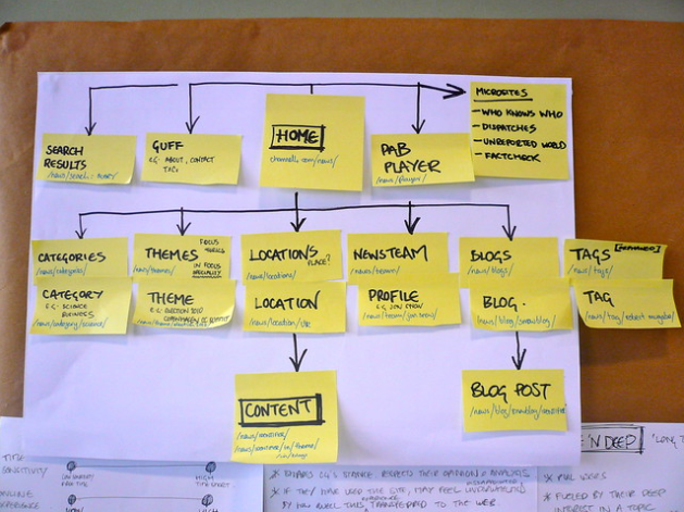
No doubt, well-thought-through site navigation is of great importance. To be efficient it shall look and function in a certain way. This article will reveal particular points to consider while designing and upgrading a website. But, firstly, we shall explore what effective navigation refers to.
The points below are to describe the key principles to keep web navigation working:
-
Keeping it Clear:
While designing navigation elements one shall always remember about making them intuitive and client-oriented. There’s a so-called 3-click method, which implies that a user is supposed to open a page he or she needs performing only three clicks. It’s easy to ensure if service navigation is clear enough.
-
Respecting Standard Norms:
Whatever people say about being creative, still, there are specific standards that must be followed to design decent site navigation. People become used to a particular course of things, and they’re not so much willing to waste their time figuring out where to find social media buttons and other page components;
-
Ensuring Accessibility of Every Page:
It’s critical to install required navigation options on each page of the website. Such a technique shall facilitate the interaction with the platform;
-
Proper Designing of Website Menu Components:
All elements shall contrast with the colors of the background to stay notable. Any possible conflicts with the color of the online program must be avoided;
-
Making CTA Noticeable:
Undoubtedly, call-to-action buttons are to be clearly visible at once, thus, the audience can perform any action needed without a hitch. For instance, if you deal with eCommerce website development, clients shall have no trouble ordering goods they like.
Creating a Successful Navigation Design
It’s time to discover how to develop robust navigation elements.
# Proper Planning is a Must
To start app owners should find the answers to specific questions, like:
- What final demographics the service is for?
- What key purpose the platform shall serve to?
- Which content modules will it provide?
- How to group program content to get customers’ priorities straight?
After you decide on the above issues it’s about time to take care of the below important nuances:
-
The Content
Make sure you know exactly what info will be available at your online resource;
-
The Structure
It’s better to build a detailed sitemap for the convenience of your clients;
-
The Elements
Determine what components your menu shall include, and create the design.
# Know the Limits of Being Creative
It would be great to add a bit of creativity to web navigation, just be careful with that.
Superfluous originality might actually harm your service UI. Having unconventional styling, as well as uncommon menu elements’ locations can possibly lead to confusion, or visitors could just get annoyed. Thus, they’ll simply leave the platform increasing rejection level and decreasing conversions.
# Remember of Being Logical and Coherent
Such an approach will better your menu layout. And, once again proper planning shall help you arrange every component reasonably. There must be no surprises or confusion. Keep it all straight and understandable.
# Create Adequate Titles for your Bar Menu Buttons
The key task is to make them as informative as possible. To the contrary, the audience might feel lost and confused about where to click to reach the page wanted or to perform the desired action.
# Focus on Keeping Navigation Usable
Remember about usability, meaning, make it operational and customer-oriented. Remove scrolling that is actually unnecessary, since it’s not comfortable to apply. Help your customers clearly see where exactly they are at this very moment.
# Avoid Placing Numerous Elements
The simpler the better. Putting lots of components will distract clients, so they won’t perform certain actions app owners expect them to. To become effective, perfect navigation shall include 7 components at the most. We realize that such a rule isn’t always applicable, that’s why you might require to cluster and categorize your menu items.
The homepage of Microsoft serves as the example, cos the major navigation bar shows 4 categories only, and the drop-down menu reveals all the options.
# Point Out the Most Essential Items
Obviously, certain menu components are more critical and significant compared to others. Hence, they better be highlighted with:
- particular visual effects, say, a specific color;
- smart hierarchy, cos the first and the last element are the most memorable.
So, you can apply both approaches: keep the most essential items at the very first positions and point them out to attract the required attention.
# Analytics Shall Help you Out
Analytical instruments will assist you to design effective web navigation.
Everyone has heard of Google Analytics, so feel free to take advantage of its possibilities. That service will help you figure out what navigation item is being applied the most. The analysis results will serve to upgrade your site navigation, let’s say:
- to remove infrequently applied components;
- to adjust and rename poorly used elements that cannot be taken out;
- to place frequently applied items to the top of the bar.
# Take Advantage of CTA
Every site shall have a call-to-action button since it represents an indispensable ingredient of every online resource. We would distinguish the 3 mandatory conditions to turn those buttons effective:
- CTA shall be well-visible on the page, so users notice them right away;
- Short inspiring descriptions will better motivate people to act;
- Buttons’ titles must be clear and expressive.
# Stay Away from Multi-leveled Bars
We’ve already mentioned the Microsoft homepage having drop-down menu items. It’s a great approach to apply. However, don’t overdo it, putting too many options. Then, the results might be completely opposite.
The point is multi-leveled bars are truly inconvenient for searching robots. Additionally, some customers could get irritated with that structure. Having multiple categories and subcategories the audience can struggle to find the required page.
# Work on Content and Website Menu Designing
Visual presentation matters a lot. Color schemes, styles, items’ positioning… every detail shall be well-thought-through. It’s critical to make your screen look clear, consistent, as well as accurate, of course.
# Make Registration Procedures Nice and Smooth
Strive for perfection as to your registration page, since the more convenient and efficient it gets, the more successful your website turns. That’s the case of platforms that require users’ registration before people can start enjoying the resource. Thus, the experience of registration/sign-in is truly important. Make it intuitive and easy-to-apply.
# A Website Must be Responsive
Last but not least… The responsiveness. An effective site is the one that looks great from any device on any screen, meaning, a program must easily adjust to different page sizes.
You can take advantage of multiple tools to ensure proper responsiveness, and the hamburger menu layout is one of such instruments.
No matter what you actually need – to build a platform from scratch or to upgrade an existing solution – your web navigation will turn effective and dignified, if you follow our recommendations.


